 214-904-9400


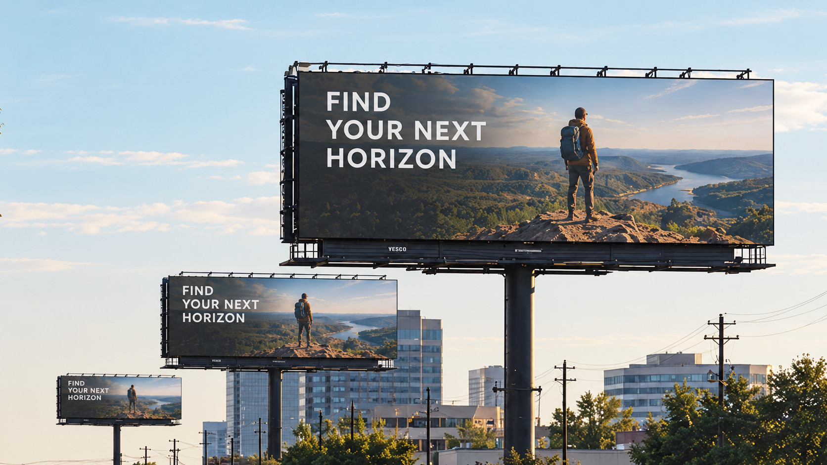
Here’s a mistake we see constantly, usually from designers who are genuinely talented, just working in the wrong environment for the job. They build a sign on a monitor, zoomed in, two feet from their face, adjust the text size until it looks balanced and readable at that distance, and send it to print. Then it goes up on a building sixty feet from the road, and nobody driving past can actually read it.
The text isn’t too small because anyone made a bad design choice in the usual sense. It’s too small because the entire design process happened at the wrong viewing distance, and that distance is the single most important variable in signage that almost never gets discussed with the same seriousness as color or layout.
The Formula Most of the Industry Actually Uses
There’s a widely used rule of thumb in sign design: roughly one inch of letter height supports about ten feet of readable viewing distance for a person with normal vision under good lighting conditions. A 3-inch tall letter is comfortably readable from about 30 feet away. A 12-inch letter extends that to roughly 120 feet. This isn’t an exact law of physics, lighting, contrast, and font choice all shift the number somewhat, but it’s a genuinely useful starting point that almost nobody designing on a laptop screen actually applies before finalizing a layout.
The reason this formula gets ignored so often isn’t laziness, it’s that a screen gives zero intuitive feedback about real-world distance. A headline that looks appropriately bold and legible at arm’s length from a monitor carries no information at all about how it will perform from across a parking lot, down a highway, or across a trade show floor.
Quick Reference: Letter Height to Readable Distance
| Letter Height | Approximate Readable Distance |
| 3 inches | About 30 feet |
| 6 inches | About 60 feet |
| 12 inches | About 120 feet |
| 24 inches | About 240 feet |
| 36 inches | About 360 feet |
Context Changes the Math, Every Time
The ten-feet-per-inch rule is a starting point, not a fixed answer, because viewing conditions change the equation substantially. A sign read by someone walking slowly past a storefront has a completely different acceptable size than one read by someone driving 45 miles per hour on an access road, where they have maybe two or three seconds of actual attention to spare before they need to look back at traffic.
Trade show graphics face the opposite problem from highway signage. A booth’s main header needs to be readable from across a wide aisle to pull people in, often 20 to 40 feet away, while the supporting details, a tagline, a QR code, contact information, only need to work at the much closer distance of someone standing directly in front of the booth. Treating every piece of text in a single design at the same scale, instead of thinking through who’s reading each element and from how far away, is one of the most common and most fixable mistakes in trade show design.
Contrast Matters as Much as Size
Size alone doesn’t determine readability, contrast does a huge amount of the work too. Dark text on a light background, or light text on a dark background, reads substantially further away than similarly sized text in low-contrast color combinations like medium gray on white or a mid-tone blue on a slightly darker blue. A sign built with correct sizing for its viewing distance can still fail to read clearly if the color contrast is working against it instead of for it.
This becomes especially important with backlit and illuminated signage, where ambient light conditions change throughout the day. A sign that reads clearly against a bright midday sky can lose contrast dramatically at dusk, when the sky brightness and the sign’s own brightness start to compete rather than contrast.
The same principle applies indoors, just with different variables. A trade show hall with mixed overhead lighting and neighboring booths competing for attention is a much harder contrast environment than a quiet hallway, and a color combination that tested fine in an office under even lighting can wash out completely next to a brighter, more saturated booth a few feet away.
Font Choice Changes the Math Too
The one-inch-per-ten-feet rule assumes a reasonably clean, simple typeface. Switch to a thin, light-weight font or anything with delicate serifs and fine detail, and that same letter height reads at a noticeably shorter distance, because the actual ink coverage, the part of the letterform that’s dark or light enough to register against the background, is thinner and easier to lose at a distance, especially in bright sun or low contrast conditions.
Bold, simple sans-serif fonts with generous letter spacing consistently outperform decorative or condensed typefaces at distance, even at identical letter heights. This is exactly why highway signage, emergency signage, and most large-scale wayfinding systems lean almost universally on clean, heavy, evenly spaced lettering. It’s not a lack of creativity, it’s the font choice that actually survives being read from a car window or across a parking lot. Save the decorative, tighter typography for anything meant to be read up close, like a menu board or a small interior directory, where the viewing distance is short enough that fine detail still registers.
Why This Gets Overlooked So Often
The honest answer is that viewing distance isn’t visible in the design software. Color is visible. Layout is visible. Font choice is visible. Viewing distance only becomes visible once the sign is actually printed, mounted, and viewed from its real final distance, which by then is usually too late and too expensive to fix without a reprint.
The fix isn’t complicated, it’s just a step that has to happen deliberately rather than assumed. Before finalizing a large format design, it’s worth asking a specific, concrete question: where exactly will people be standing or driving when they read this, and how far away is that in feet? That single question, asked early, prevents more readability failures than almost any other design review step.
A Quick Checklist for Getting Viewing Distance Right
- Identify the actual distance your primary audience will be reading from, not an assumed average
- Apply roughly one inch of letter height per ten feet of needed readability as a starting benchmark
- Prioritize high-contrast color combinations, especially for anything viewed at a distance or in changing light
- Size different elements of the same design differently based on how close each one is meant to be read
- Print and view a physical proof at real scale and real distance before finalizing a large or expensive print run
The Bottom Line
A sign that looks perfect on a screen and unreadable in the real world hasn’t failed because of bad design taste, it’s failed because the design process skipped the one variable a monitor can never show you. Getting viewing distance right from the start is one of the cheapest, easiest fixes in all of large format printing, and one of the most consistently skipped.
If you’re planning a sign, a building wrap, or a trade show display and you’re not sure how it’ll actually read from where people will be standing, XL Digital can walk through the sizing with you before anything goes to print, which is exactly when that conversation is worth having.