
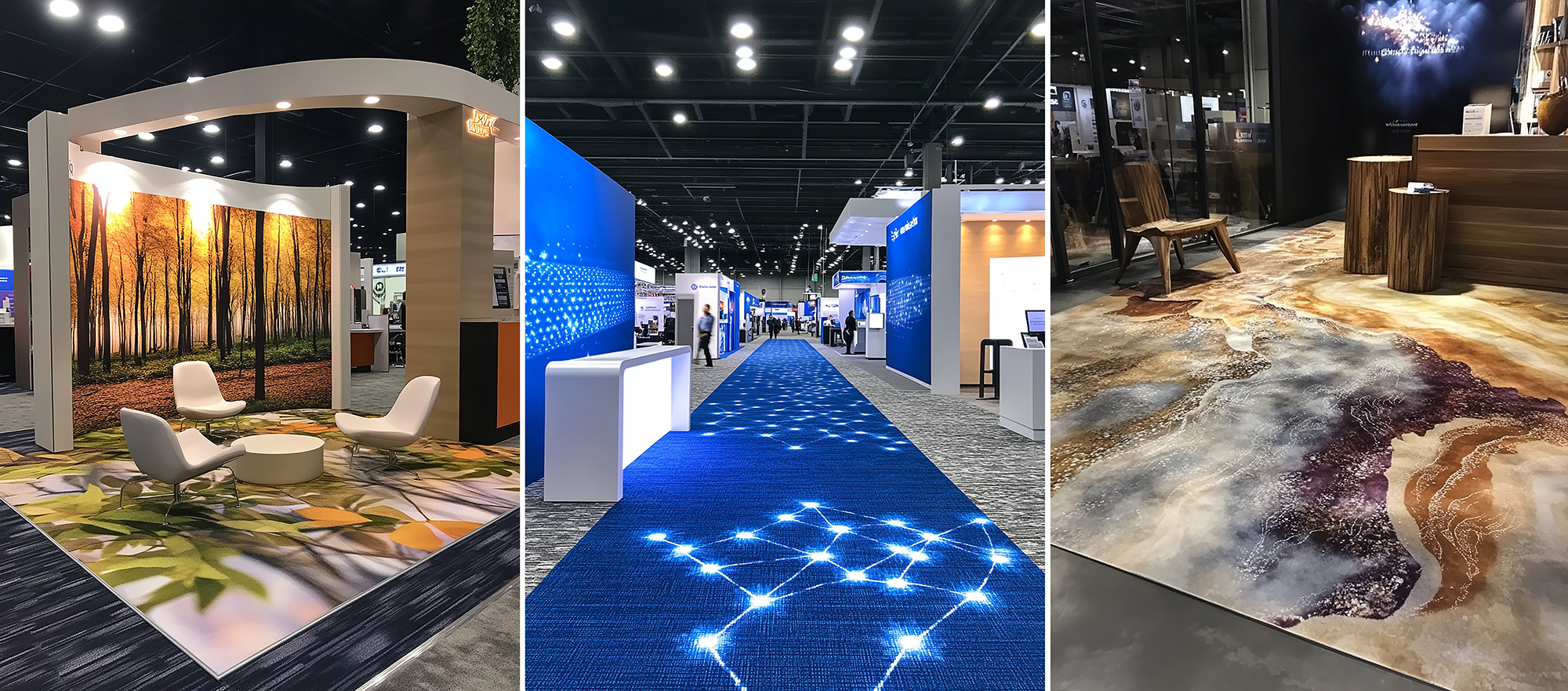
When designing for carpet, you’re working with one of the most unique printing surfaces available in large format printing. Unlike traditional rigid or vinyl substrates, carpet brings its own personality to every project. Let’s explore how to make this distinctive medium work for your designs.
The Magic of Carpet Printing
Imagine running your hand over freshly printed carpet. The texture, the way light plays across the surface, the sense of depth – these elements make carpet graphics uniquely engaging. Carpet doesn’t just display your design; it adds dimension and tactile interest that can transform an ordinary graphic into something extraordinary.
Design Considerations That Matter
Here’s what every designer should know when creating graphics for carpet printing:
- Work bold. Fine details and thin lines often get lost in carpet’s texture. Opt for strong, clear design elements that hold up at walking distance.
- Consider foot traffic patterns when placing key design elements.
- Allow extra contrast – carpet tends to soften color contrast compared to paper or vinyl.
- Plan for size distortion – designs can appear up to 20% smaller when viewed from standing height.
- Remember that light colors may get lost in carpet’s texture, especially in high-traffic areas.
The Right Design Approach
Think of designing for carpet like creating theatre stage designs – it needs to work from multiple angles and distances. Your viewers will see it while walking toward it, standing on it, and looking across it from various distances. A design that looks perfect on your screen might read completely differently when installed.
Take directional design cues from how people will move through the space. Just as water flows downstream, people tend to follow visual paths. Use this natural tendency to guide traffic flow or draw attention to specific areas of your space.
Color Psychology on the Floor
Colors behave differently on carpet than on other materials. Dark blues and deep reds tend to maintain their richness, while yellows and light greens might appear muted. Some practical tips for color selection:
- Navy blues and burgundies create sophisticated paths and borders.
- Black elements provide strong contrast but show footprints more readily.
- Bright colors work best as accents rather than large fields.
- Consider using color gradients to create depth and movement.
- Test critical colors on actual carpet samples before final production.
Real-World Wisdom
Large Fields of Color
- Break up large solid areas with subtle patterns.
- Use texture to add interest to monochrome areas.
- Consider how cleaning will affect solid color areas.
Text and Logos
- Add extra spacing between letters and lines.
- Increase stroke weights on fonts.
- Keep critical text away from seams and high-traffic paths.
Making It Last
Your carpet graphic needs to look good from day one through the end of your event. Consider these factors for maximum durability:
- Place detailed elements away from main traffic paths.
- Use darker colors in high-traffic areas to hide wear.
- Plan seam placement to protect critical design elements.
- Include extra contrast to compensate for eventual wear.
Creating Success
Remember that carpet graphics offer a unique opportunity to extend your design into an often-overlooked dimension. Whether you’re creating wayfinding elements, branding statements, or interactive spaces, understanding how to work with carpet’s unique properties will help ensure your design achieves maximum impact.
Need help bringing your carpet graphic design to life? Our team at XL Digital can guide you through material selection and production requirements to ensure your vision translates perfectly to the final product. Let’s create something remarkable together.